Case Study – UX Design II
The Overview
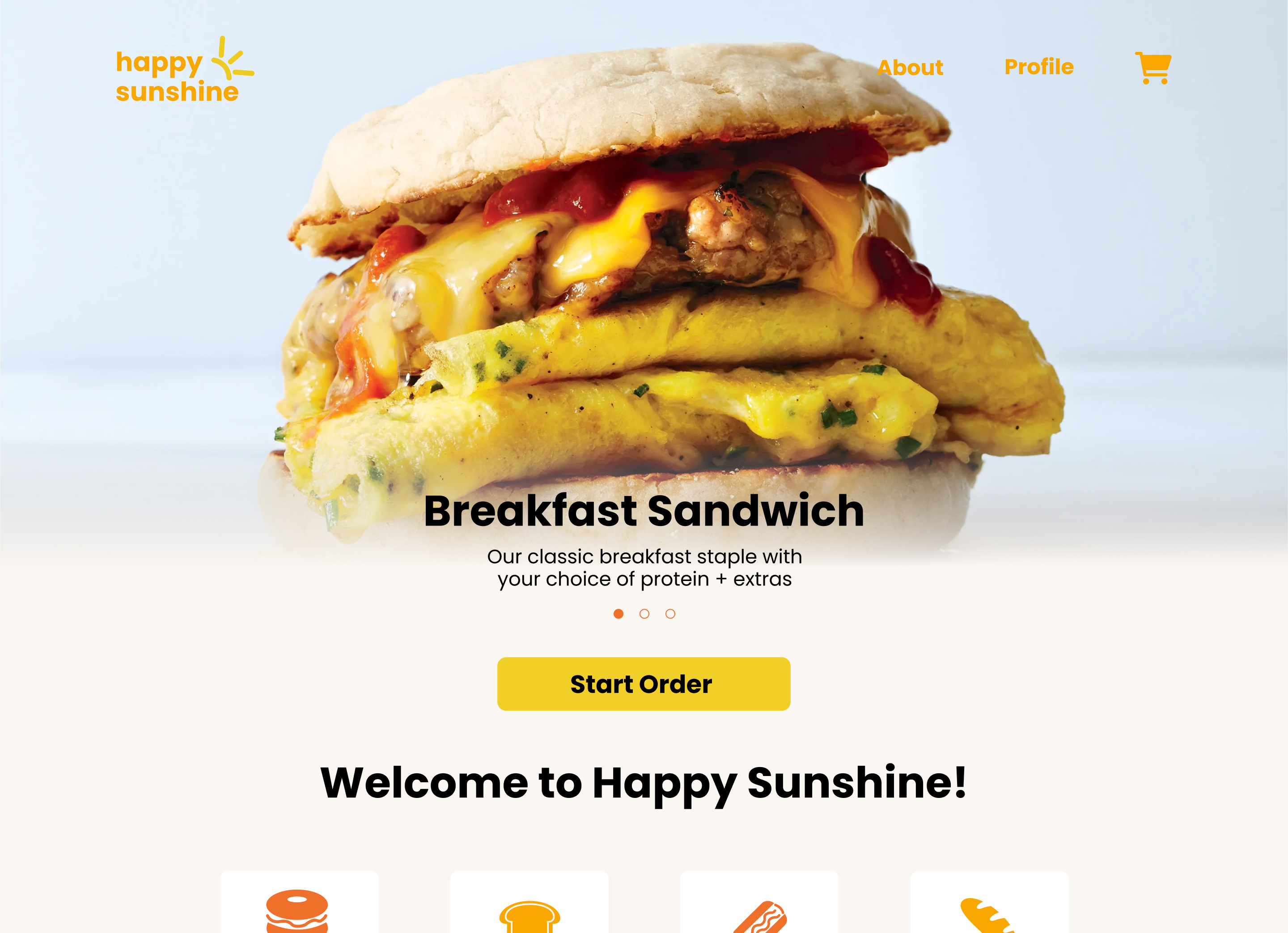
The objective for this project was to develop a dynamic, functional food ordering website – optimized for all screen sizes. We were given an original design for this food ordering website, and allowed to tweak it if we chose to do so. Once we were set on the design, we developed the mobile version first – followed by the tablet and desktop versions in the weeks leading up to the finalized project. The project was successful since we were able to develop a dynamic, functional food ordering website.
Context and Challenges
Background / Timeline / Purpose
I worked closely in a group of 5 total people, as the lead developer, in order to develop a dynamic, functional food ordering website. Over a span of 10 weeks, I developed this website by first starting at the mobile breakpoint, followed by the respective tablet and desktop breakpoints. We were given full designs for the website, and applied minor changes to them, since our lead designer had designed them a few months prior.
The Problem
This project exists to explore the possibilities of data storage and retrieval, as well as how to work in a team on a long-term project.
Goals and Objectives
This project can be defined as successful if the final product consist of a dynamic, functional food ordering website.
Process and Insights
Target Audience
The main target audience is college students who order food from food trucks often. A more broad target audience would be anyone who often orders food.
Process
Alpha
The project started off with looking at designs and determining whether they should be changed or not. I did not partake in this, since I am the lead developer and I trusted our lead designer to make the right decisions. Once this was set, they were handed off to me so I could produce the alpha of the project. The alpha consisted of only a mobile breakpoint, and minimal to no microinteractions. Our beta consisted of all of our main screens, minus the login screen, and I also developed a functional hamburger menu.
Beta
Once the alpha was developed, our project manager, data architect, secondary coder, and our lead designer went and did user testing, and brought back feedback in order to improve the overall experience. We didn’t get much negative feedback at all, so very little changes were made to the product. I started developing the beta, which consisted of a tablet breakpoint, as well as some microinteractions and at least one example of database retrieval. The links to the different ordering pages are all dynamic, meaning the information on the linked page will be different depending on what link is clicked.
Final
Once the beta was developed, the team did another round of user testing, and we made tweaks to the website accordingly. I then started developing the final. The final consisted of a desktop breakpoint, so the website would look on all screensizes, as well as full databse and javascript integration. Starting on the homepage, I developed a “widget” (I like to call it that) that consists of an image of a cart icon, as well as a number that appears when something has been added to the cart. This number increases or decreases on every page, and will always take you to the cart – which is updated with information relative to what you have in your cart.
Going through the order flow, users will find that the price of an item changes depending on if it’s toppings cost money. This is reflected in the cart, and if a user has multiple items in their cart, a “grand total” is shown at the bottom of the cart, which is the sum of money that all items cost. The receipt and order summary pages reflect the order information, which was done with multiple tables, and copying information from one table to another. The order tracking page is a functional, sped-up representation of how it would look to be tracking your order, and was created using timed javascript functions.
After a user has completed the full order flow, they are taken back to the home page. From there they can access the recent orders page and view their recently ordered food. They can click on the heart icon to add a previous order to their favorite orders page, which dynamically updates depending on what users favorite. The heart on the recent orders page becomes filled in, to signify that that order has been favorited – this is reflected on the favorite orders page, where all hearts are filled in.
The Solution
Dynamic, Function Food Ordering Website
The solution to this project is a dynamic, functional food ordering website, which looks good no matter what screen size a user may be using.
The Result
Overall, I’d say this project was a success. It was the most intensive PHP and MySQL project that I have ever done, so I’m relieved that it turned out good.