Case Study – Microinteractions
The Overview
The objective for this project is to improve a pre-existing microinteraction, or to design and develop a unique microinteraction that can be used to improve the web. In a 10 week timeframe, I designed and developed 3 microinteractions – each of which built on top of the last. I chose to go the route of creating a unique interaction instead of improving a pre-existing one. I worked on a figma design file to design each of the interactions, and once they were designed I moved over to visual studio code to develop them. The final product is an image gallery that can open and close whenever a user clicks on a button. This project is successful because the final product is a unique microinteraction that can be used to improve websites with image galleries.
Context and Challenges
Background / Timeline / Purpose
I was tasked with designing and developing a complex microinteraction, which would improve some sort of feature that could be on a website. The given timeframe was 10 weeks, and I built up to the final complex microinteraction by experimenting and developing smaller, less-complex interactions.
The Problem
This project exists to experiment with different microinteractions. You could take the approach of improving a pre-existing interaction, or develop your own unique interaction. The project as a whole seeks to solve the issue of either boring, poorly designed, or uneventful microinteractions across the web.
Goals and Objectives
This project can be defined as successful if it has either improved a pre-existing microinteraction, or if the developer creates a unique interaction that can be used to improve the web.
Process and Insights
Target Audience
The target audience for this project is anyone who uses the web, frequently or not frequently, to accomplish some sort of goal. These goals can be, but are not limited to, finding or viewing information.
Pre-Development Designs
Alpha Designs
This is my first experimentation with creating a microinteraction. This design consists of a single image, with no other content. However, when a user hovers over an image, the image darkens slightly while text fades in and moves up from the bottom of that image. I designed this because I feel it could help companies to organize and display information differently.


Beta Designs
This microinteraction builds off of the alpha interaction. When a user hovers over the “Drexel University” image, the title slides up to show more information describing the title, along with a “Gallery” button on the right. Upon clicking the gallery button, more images appear in a grid format. This microinteraction is an image gallery which users can expand and contract as they need. Once the image gallery is open, the text and color on the “Gallery” button changes. It is now a red button which says “Close”. Clicking it closes the gallery. I designed this because I feel that some websites have content that some users don’t necessarily want taking up space on their screen, so having the option to expand or contract content gives users a choice to view or hide content that they are not interested in.


Final Designs
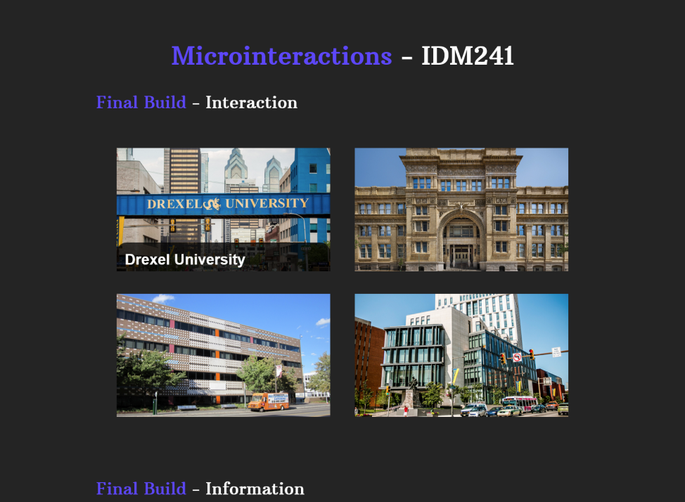
I had come pretty far with my image gallery idea, so I figured I’d stick with it for the final microinteraction. This interaction builds off of the beta microinteraction, and works the same way. Hovering over the first image causes the text to slide up, as well as a button which opens the image gallery when clicked. However, instead of just opening and closing an image gallery, the user now has the option to click on any of the images that have just appeared. Upon doing this, a modal will pop up, showing a larger version of the clicked image, as well as a title for the image. Clicking the “X”, or clicking out of the picture causes it to fade away. I designed this interaction to improve the look, feel, and functionality of “pop-out” image galleries.


The Solution
Final Developed Microinteraction
Below are images of the final developed microinteraction, as well as a link to the finished product. It turned out looking identical to how I designed it, and is completely functional. The only issue I had was sizing/organizing the modals on mobile, but I overcame this by giving them a fixed positioning, so they always appeared in the middle of the screen no matter where the user clicked.


The Result
Overall, I’d say that this project was a success. I accomplished what I set out to do, which was to design and develop a microinteraction that can be used to improve the web. It is compatible on mobile devices as well, which means it can be viewed from basically any device and still look good and work efficiently. I’m happy with the outcome of this project.